Now More Clearly See How Your Town Compares At ClearGov we pride ourselves on being good listeners and taking direction from our clients. So when one of our newest clients mentioned that they would like to see a visual comparison of how their town compares to similar towns, we took that to task. The result is that today we released a small enhancement that has a big visual impact. Benchmarking is core to ClearGov and conveying the data behind this benchmarking is a key element of validating the figures. With this in mind we have added a new stacked bar chart to our benchmarking modal windows. Now whenever you click a benchmark metric for more info you will see this: 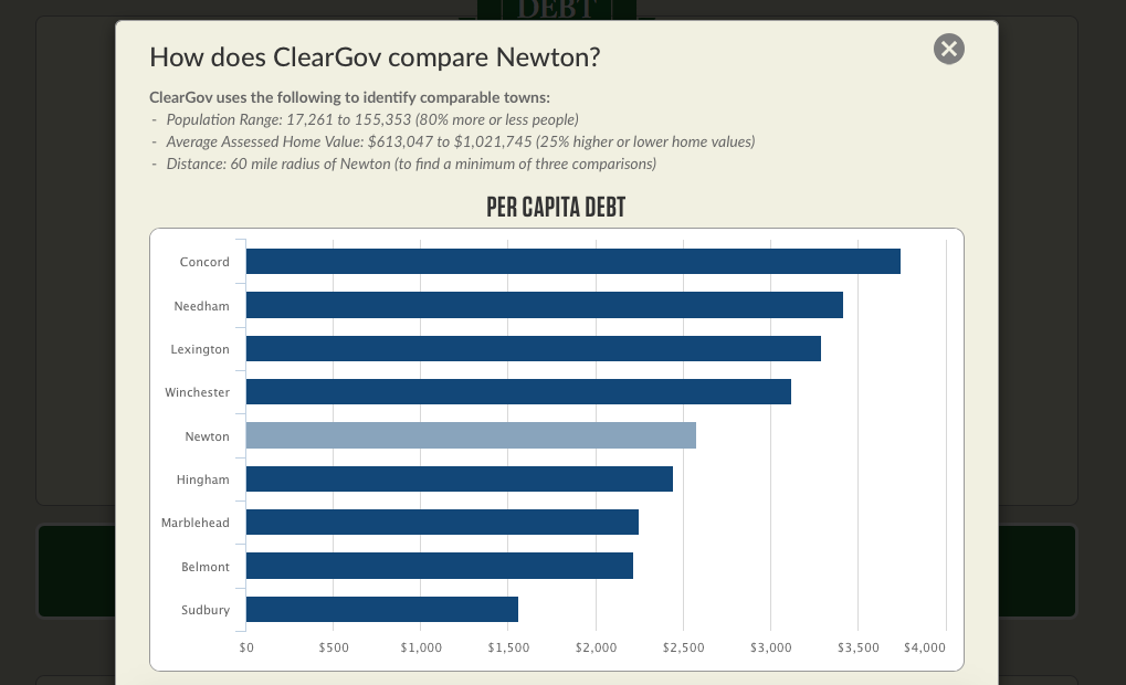 This bar chart stack ranks the per capita figure that you are benchmarking for each municipality. So you can not only see that your town spends 35% more on education, for instance, than similar towns, but you can also see how this stack ranks against these similar towns. We hope you find this enhancement interesting and useful. Please leave a comment below if you have any questions or suggestions.  |